I got a pack of 2011 Topps Chrome in one of those 12-pack Fairfield repack boxes. First out of the pack was this.
2011 Topps Chrome Heritage Refractors #123 Brent Morel
So here is something that Topps did in 2011 that will be confusing to future collectors. 2011 Topps Heritage was based on 1962 Topps. Parallel cards included chrome and chrome refractor versions. But this isn't a Topps Heritage Chrome card. This came in Topps Chrome. Notice the Topps Chrome logo instead of the Topps Heritage. The Topps Chrome Heritage also have a slightly different finish than the Topps Heritage Chrome. Confused? Aside from all that, I didn't have one of these and now I do. These cards were numbered to 562.
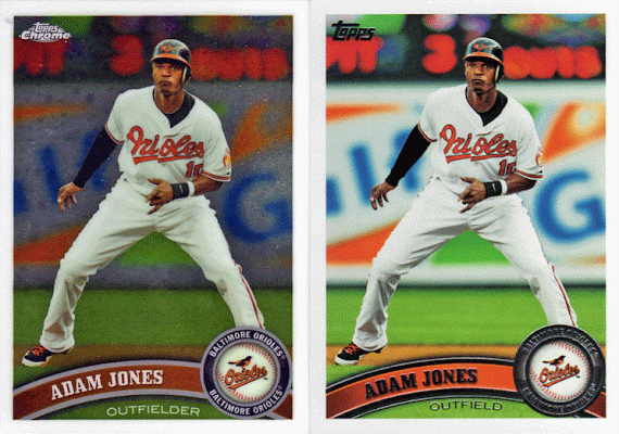
There was nothing special about the other three cards in the pack except that I had the regular Topps version of each card. I scan a lot of cards and put the scans in a Filemaker database. If i switch back and forth between the base version of a card and a parallel version I can get an idea of how well the cards are centered, at least in reference to each other. Centering is a big deal in card grading, especially in earlier cards as apparently cutting big sheets of cards was prone to errors. How many times have you seen a perfectly acceptable Topps card from, say 1975, that had most of the border on one side sliced away while the other side had a border than went on forever.
Apparently they have gotten much better at this from what I can see when comparing cards in my database. It occurred to me that I could show this with an animated gif, if only I knew how to make one. With the help of my talented daughter, we figured out this was absurdly easy in Photoshop Elements. The only thing that would work right was the timing of the loop. I tried to lengthen the loop but Elements wouldn't pay attention to me.
Anyway here's the three Topps Chrome cards along with their Topps base.
Not too bad. The slight jiggling effect is because the two cards aren't exactly aligned. Here's another:
This one is darn near perfect.
This last one is interesting. I've noticed that Topps doesn't always use the exact same picture for these parallels. I've seen also when comparing Topps to Topps Opening Day. Sometimes they use an entirely different picture. But some times it's just cropped differently, like this one.
I've always wondered why this happens.
Subscribe to:
Post Comments (Atom)


3 comments:
Awesome, I thought it would be cool to do that with my Tony Campana rainbow collections but never bothered to figure it out.
All I can think of is that Wang Chung music video and how it was banned in Britain because people might suffer seizures.
Needs some techno background music.
Oooncha oooncha oooncha
Post a Comment