Continuing a series of posts of 2016 cards of Players I Collect that had cards in 2016. I'm excluding Phillies and Astros since I collect all of them. The last player was Ichiro. Next up Bo Jackson.
2016 Topps Bunt was good for a lot of former players. I have 98 Bo Jackson cards in my collection. A career cut way too short.
Yet another Topps Bunt card. Jackson started his career in 1967. I have 78 Reggie Jackson cards but the earliest cards I have for him are in the 1980s. Not surprising as I didn't start collecting until 1985.
7 years after he retired in 2009, The Big Unit still seems popular with the hobby. I have 293 cards of him, bolstered by the half season he played for the Astros in 1998. He was 10-1 with an ERA of 1.98 in 11 starts, helping the Astros into the playoffs.
I only managed to pull one Chipper Jones card this year. A sure Hall of Famer, I have 313 of his cards. The first time I ever heard of Chipper Jones was in 1990, when a guy in my fantasy baseball league drafted him for cheap. He held on to Jones for years.
That's enough for today. Next up, Bary Larkin (yep, another Topps Bunt card)
Showing posts with label Bo Jackson. Show all posts
Tuesday, October 18, 2016
Wednesday, February 10, 2016
The 1990s Baseball Card Faceoff
We're at the final matchup of the 2nd Quartile of the Babe Ruth Division.
Today we've got 1994 Donruss vs. 1991 Fleer
1994 Donruss
1994 Donruss is one of my favorite sets of the 1990s. It featured full bleed photography front and back, a nice glossy finish and not too much gold foil. If it has one flaw, it's the box on the front with the set name and team logo. The box on the back is OK, but the solid black background does distract from the photo a bit. The full-sized photo on the back is largely uncluttered but at the expense of a single line of stats.
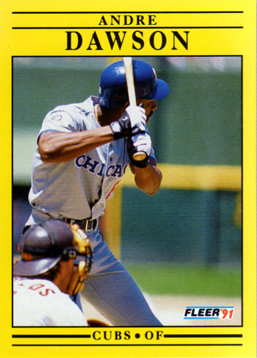
1991 Fleer
The first question might be, how did 1991 Fleer get to the second round of this competition? See the bracket above. It had the luck of meeting the ultimate gimmick set of the 1990s, bubble-gum smelling 1996 Pinnacle Aficionado. 1991 Fleer, while in many better than previous years of Fleer, is still not a great design. And the yellow color, well, that depends on your sense of humor (or outrage), I suppose. And. while not pertinent to the design, these cards are hard to scan. It's hard to get the yellow to come out right on screen.
The Results: One of my favorite cards from the 1990s vs. 1991 Fleer? It's 1994 Donruss in a walk-off.
Going forward:
Some interesting head-to-head competition coming up.
Today we've got 1994 Donruss vs. 1991 Fleer
1994 Donruss
1994 Donruss is one of my favorite sets of the 1990s. It featured full bleed photography front and back, a nice glossy finish and not too much gold foil. If it has one flaw, it's the box on the front with the set name and team logo. The box on the back is OK, but the solid black background does distract from the photo a bit. The full-sized photo on the back is largely uncluttered but at the expense of a single line of stats.
1991 Fleer
The first question might be, how did 1991 Fleer get to the second round of this competition? See the bracket above. It had the luck of meeting the ultimate gimmick set of the 1990s, bubble-gum smelling 1996 Pinnacle Aficionado. 1991 Fleer, while in many better than previous years of Fleer, is still not a great design. And the yellow color, well, that depends on your sense of humor (or outrage), I suppose. And. while not pertinent to the design, these cards are hard to scan. It's hard to get the yellow to come out right on screen.
The Results: One of my favorite cards from the 1990s vs. 1991 Fleer? It's 1994 Donruss in a walk-off.
Going forward:
Some interesting head-to-head competition coming up.
Monday, April 13, 2015
Capewood's Theory of Baseball Card Evolution
Over the past week, I've reviewed how Bowman, Donruss and Fleer evolved in the 1990s. I'll be getting to Score, Topps and Upper Deck next. Before that however, I want to present my theory of baseball card evolution. A few disclaimers and caveats first.
First, there are a lot of card blogs out there and there have been a lot of posts since I started card blogging in 2008. I haven't read them all. If someone else has already espoused on this theme, I apologize in advance.
Second, we've seen a lot of card designs over the years. There are some things I don't consider to be evolutionary such as: holographic cards, cards with texture (think 1999 Metal), die cut cards, odd-sized cards, cards that open like a book, foil board or dufex printing, etc. I consider these to be gimmicks.
Third, I don't consider cards printed on something other than cardboard, such as plastic, cloth, metal, or wood to be evolutionary. They might be nice, but they're gimmicks as well.
Fourth, I'm not making any value judgements here. If I say a card is higher up the evolutionary scale than another, I'm not saying it is better. There are a lot of design decisions that go into a card. The technical level of the card may not even be the most important.
Stage 1
The first baseball cards were rectangle shaped pieces of cardboard with a player photo on the front and some information about the player on the back. Eventually we got to the current 'standard' size and 'standard' layout with a player photo on the front and player stats on the back. Card stock was generally grey or brown (occasionally white). The card borders (and at this stage, the cards always have borders) could be white, or some other color, or pattern. Pick any card from between 1951 and 1980.
Stage 2
White card stock. When Donruss and Fleer successfully fought the Topps monopoly in 1981, they both took this step, going to white card stock. This stage doesn't have much else to distinguish from Stage 1. Again, border colors may be white or colored. The backs have stats and little more, although some Fleer cards from this era have tiny photos on the back. Think of any Donruss or Fleer card from 1981 through 1992 or so.
Stage 3
Take your Stage 2 card and add a color photo to the back. This is how both Score (in 1988) and Upper Deck (1989) started. Other brands would eventually follow.
Stage 4
Take your Stage 3 card and add gloss to it. There was nothing new about glossy baseball cards. All three main brands in the 1980s had produced either parallel sets (think Topps Tiffany), or specialty sets with gloss. Glossy main stream sets began appearing in the early 1990s. I think 1991 Stadium Club was the first main stream set with gloss but this set started several more stages up the evolutionary ladder. Of the 6 sets I'm tracking, Bowman was the first with gloss, front and back, in 1992.
Stage 5
Now add some foil embossing to the front. Again, Stadium Club was doing this in 1991. Topps started printing gold foil parallel sets in 1992 but by 1995, foil was an integral part of nearly every card design.
Stage 6
The next stage is full bleed printing. This is actually a big technological change in how cards are printed. There is a lot less leeway for printing errors, especially off-center cutting, with this technique. It is typical that Stage 5 cards will include the Stage 3 and 4 techniques as well (that is, these cards will be glossy and have foil). Originally, cards printed this way were considered premium cards but eventually, it became the norm (think Upper Deck from 1995 on).
Stage 7
I had originally planed to stop at Stage 6 but decided that there were two more stages in technological evolution. Stage 7 is very high gloss cards like Topps Finest or Topps Chrome. Another early example would be Flair, a Fleer product from the 1990s. This is 1995 Flair.
Stage 8
Autographed cards and cards with relics are so prevalent today, and there are sets where every card is autographed or has a relic, that I decided to include this as the top level of evolution. Autographed cards began appearing as early as 1994 with relic cards appearing in 2000. Below is a 1994 Phillies Ultra Autograph and a 2000 SP Top Prospects Game Used Bat.
By the discussion above, you might think that I don't believe that there's been any real technological evolution in baseball cards since 2000. That is what I think. There has been some movement toward digital cards, but I'm sorry, a baseball card that you can't actually hold in your hand isn't really a baseball card.
To finish, here is the most technologically evolved card I own. A 2003 Topps Chrome Refractor Record Breakers Relics card.
First, there are a lot of card blogs out there and there have been a lot of posts since I started card blogging in 2008. I haven't read them all. If someone else has already espoused on this theme, I apologize in advance.
Second, we've seen a lot of card designs over the years. There are some things I don't consider to be evolutionary such as: holographic cards, cards with texture (think 1999 Metal), die cut cards, odd-sized cards, cards that open like a book, foil board or dufex printing, etc. I consider these to be gimmicks.
Third, I don't consider cards printed on something other than cardboard, such as plastic, cloth, metal, or wood to be evolutionary. They might be nice, but they're gimmicks as well.
Fourth, I'm not making any value judgements here. If I say a card is higher up the evolutionary scale than another, I'm not saying it is better. There are a lot of design decisions that go into a card. The technical level of the card may not even be the most important.
Stage 1
The first baseball cards were rectangle shaped pieces of cardboard with a player photo on the front and some information about the player on the back. Eventually we got to the current 'standard' size and 'standard' layout with a player photo on the front and player stats on the back. Card stock was generally grey or brown (occasionally white). The card borders (and at this stage, the cards always have borders) could be white, or some other color, or pattern. Pick any card from between 1951 and 1980.
Stage 2
White card stock. When Donruss and Fleer successfully fought the Topps monopoly in 1981, they both took this step, going to white card stock. This stage doesn't have much else to distinguish from Stage 1. Again, border colors may be white or colored. The backs have stats and little more, although some Fleer cards from this era have tiny photos on the back. Think of any Donruss or Fleer card from 1981 through 1992 or so.
Stage 3
Take your Stage 2 card and add a color photo to the back. This is how both Score (in 1988) and Upper Deck (1989) started. Other brands would eventually follow.
Stage 4
Take your Stage 3 card and add gloss to it. There was nothing new about glossy baseball cards. All three main brands in the 1980s had produced either parallel sets (think Topps Tiffany), or specialty sets with gloss. Glossy main stream sets began appearing in the early 1990s. I think 1991 Stadium Club was the first main stream set with gloss but this set started several more stages up the evolutionary ladder. Of the 6 sets I'm tracking, Bowman was the first with gloss, front and back, in 1992.
Stage 5
Now add some foil embossing to the front. Again, Stadium Club was doing this in 1991. Topps started printing gold foil parallel sets in 1992 but by 1995, foil was an integral part of nearly every card design.
Stage 6
The next stage is full bleed printing. This is actually a big technological change in how cards are printed. There is a lot less leeway for printing errors, especially off-center cutting, with this technique. It is typical that Stage 5 cards will include the Stage 3 and 4 techniques as well (that is, these cards will be glossy and have foil). Originally, cards printed this way were considered premium cards but eventually, it became the norm (think Upper Deck from 1995 on).
Stage 7
I had originally planed to stop at Stage 6 but decided that there were two more stages in technological evolution. Stage 7 is very high gloss cards like Topps Finest or Topps Chrome. Another early example would be Flair, a Fleer product from the 1990s. This is 1995 Flair.
Stage 8
Autographed cards and cards with relics are so prevalent today, and there are sets where every card is autographed or has a relic, that I decided to include this as the top level of evolution. Autographed cards began appearing as early as 1994 with relic cards appearing in 2000. Below is a 1994 Phillies Ultra Autograph and a 2000 SP Top Prospects Game Used Bat.
By the discussion above, you might think that I don't believe that there's been any real technological evolution in baseball cards since 2000. That is what I think. There has been some movement toward digital cards, but I'm sorry, a baseball card that you can't actually hold in your hand isn't really a baseball card.
To finish, here is the most technologically evolved card I own. A 2003 Topps Chrome Refractor Record Breakers Relics card.
Labels:
astros,
autographs,
baseball cards,
biggio,
Bo Jackson,
bowman,
daulton,
donruss,
phillies,
relic card,
score,
Stadium Club,
topps
Wednesday, April 8, 2015
Baseball Card Evolution in the 1990s - Donruss
Yesterday we saw how the Bowman design evolved through out the 1990's eventually reaching a design they would stick with, largely unchanged until 2011.
Today we'll look at Donruss. Donruss started on a trajectory similar to Bowman but petered out before the decade was over.
1990 Donruss #61 Bo Jackson
Donruss started in 1981 already one step up the evolutionary ladder from Topps by using white card stock. But by 1990, Donruss was stuck in a rut, albeit a colorful one. The design had hardly changed since 1985 when they first started using the colored, crazy borders. They'd also had the exact same back design, except for color. But the back design change in 1985 was only a little different from 1982. For some reason, Donruss dropped the team logo from the front which had been a feature since 1985.
1991 Donruss #78 Jim Abbott
No big design changes for 1991. The team logo is back on the front and the crazy borders are blue instead of red. The big change in 1991 Donruss wasn't in how it looked but in how it was sold. Donruss sold the 1991 cards in 2 separate series. The set had 770 cards, their biggest set yet with one half as Series 1 the other half as Series 2. Within a few years Fleer, Score, Topps and Upper Deck will follow Donruss' lead, although Bowman never did. For this first year of a 2 series set, they made the second series cards green. I think this is the only major set in which the Series 1 and Series 2 cards could so easily be differentiated.
1992 Donruss #39 Kirk Gibson
Just as 1992 Bowman did, Donruss made a big step forward in 1992. A normal white border on the front and a complete redesign for the back. A large color photo is placed prominently in the center. The other elements of the back are the same in past years, recent stats, career highlights, personal information, but arranged differently and more interestingly. They also made another organizational change. The Diamond Kings cards became an insert set, instead of being part of the base set.
1993 Donruss #86 Brett Butler
1993 represented a bit of a consolidation. No big changes. Similar to 1993 Bowman, the front is cleaner with the card logo, team logo (back again) and player name taking little space away from the photo. The back has a larger, more conventional photo, leaving no space for career highlights.
1994 Donruss #15 Robin Yount
As with 1993, Bowman and Donruss are on a similar progression. Both went to full bleed printing on the front with gold foil. But Donruss will take it one step further by going full bleed on the back as well. They also go to minimum stats, just the previous year, and a some personal information. Donruss isn't exactly a pioneer in full bleed printed backs (Stadium Club did this from the beginning). But it's a first for a so called non-premium set. Full bleed printed fronts will be the norm for Donruss while Bowman pulled back from that in 1995. This is also the first year that Donruss started adding color highlights (for example the block containing the player name), matched to the team colors.
1995 Donruss #118 Vince Coleman
1995 Donruss represents to me the height of Donruss design in the 1990s. Keeping the full bleed printing front and back like the 1994 set, but adding a small inset photo on the front and a larger range of stats on the back. I always liked the way Donruss did the stats this year and I think it's one of the best ever. The inset photo isn't original, Topps was doing it in the 1950s. But here, I like how the player is almost jumping out of the home plate shaped border.
1996 Donruss #20 Will Clark
1996 was a misstep in my opinion. They kept the full bleed printing on the front but that foil block on the front really distracts from the photo. It's fixed in position on every card and often it's just in the way. They also pulled back from the full bleed printing on the back. OK they went to more career stats, for the first time ever, but the team logo placement makes them hard to read. For players with less career, they also added back career highlights.
1997 Donruss #204 Steve Avery
Another negative change. The fading color blocks in the lower left corners don't do anything for me. Neither do the blocks of silver foil containing the team logo. The backs are largely unchanged from 1996. Donruss actually made a slight change in the front for Series 2, replacing the blocks with a silver sunburst. I generally think that foil should be limited to text or logos.
1997 Donruss Series 2 #330 Julio Franco
Maybe I like the sunburst a bit better. This was also the smallest Donruss set in years with only 450 cards. Donruss was in trouble.
1998 Donruss #23 Roger Clemens
Another poor design choice on the front. Those stripes on the bottom are horrible. The red and blue are bearable, but other team color combinations look worse. And again little change on the back. I said above that Donruss was in trouble and indeed they were. Donruss went bankrupt this year. They will return in 2001 with one awful set after another in the 2000s.
To wrap up, Donruss changed positively from 1990 to 1995. They they regressed a little, stayed the same for several years and died.
Today we'll look at Donruss. Donruss started on a trajectory similar to Bowman but petered out before the decade was over.
1990 Donruss #61 Bo Jackson
Donruss started in 1981 already one step up the evolutionary ladder from Topps by using white card stock. But by 1990, Donruss was stuck in a rut, albeit a colorful one. The design had hardly changed since 1985 when they first started using the colored, crazy borders. They'd also had the exact same back design, except for color. But the back design change in 1985 was only a little different from 1982. For some reason, Donruss dropped the team logo from the front which had been a feature since 1985.
1991 Donruss #78 Jim Abbott
No big design changes for 1991. The team logo is back on the front and the crazy borders are blue instead of red. The big change in 1991 Donruss wasn't in how it looked but in how it was sold. Donruss sold the 1991 cards in 2 separate series. The set had 770 cards, their biggest set yet with one half as Series 1 the other half as Series 2. Within a few years Fleer, Score, Topps and Upper Deck will follow Donruss' lead, although Bowman never did. For this first year of a 2 series set, they made the second series cards green. I think this is the only major set in which the Series 1 and Series 2 cards could so easily be differentiated.
1992 Donruss #39 Kirk Gibson
Just as 1992 Bowman did, Donruss made a big step forward in 1992. A normal white border on the front and a complete redesign for the back. A large color photo is placed prominently in the center. The other elements of the back are the same in past years, recent stats, career highlights, personal information, but arranged differently and more interestingly. They also made another organizational change. The Diamond Kings cards became an insert set, instead of being part of the base set.
1993 Donruss #86 Brett Butler
1993 represented a bit of a consolidation. No big changes. Similar to 1993 Bowman, the front is cleaner with the card logo, team logo (back again) and player name taking little space away from the photo. The back has a larger, more conventional photo, leaving no space for career highlights.
1994 Donruss #15 Robin Yount
As with 1993, Bowman and Donruss are on a similar progression. Both went to full bleed printing on the front with gold foil. But Donruss will take it one step further by going full bleed on the back as well. They also go to minimum stats, just the previous year, and a some personal information. Donruss isn't exactly a pioneer in full bleed printed backs (Stadium Club did this from the beginning). But it's a first for a so called non-premium set. Full bleed printed fronts will be the norm for Donruss while Bowman pulled back from that in 1995. This is also the first year that Donruss started adding color highlights (for example the block containing the player name), matched to the team colors.
1995 Donruss #118 Vince Coleman
1995 Donruss represents to me the height of Donruss design in the 1990s. Keeping the full bleed printing front and back like the 1994 set, but adding a small inset photo on the front and a larger range of stats on the back. I always liked the way Donruss did the stats this year and I think it's one of the best ever. The inset photo isn't original, Topps was doing it in the 1950s. But here, I like how the player is almost jumping out of the home plate shaped border.
1996 Donruss #20 Will Clark
1996 was a misstep in my opinion. They kept the full bleed printing on the front but that foil block on the front really distracts from the photo. It's fixed in position on every card and often it's just in the way. They also pulled back from the full bleed printing on the back. OK they went to more career stats, for the first time ever, but the team logo placement makes them hard to read. For players with less career, they also added back career highlights.
1997 Donruss #204 Steve Avery
Another negative change. The fading color blocks in the lower left corners don't do anything for me. Neither do the blocks of silver foil containing the team logo. The backs are largely unchanged from 1996. Donruss actually made a slight change in the front for Series 2, replacing the blocks with a silver sunburst. I generally think that foil should be limited to text or logos.
1997 Donruss Series 2 #330 Julio Franco
Maybe I like the sunburst a bit better. This was also the smallest Donruss set in years with only 450 cards. Donruss was in trouble.
1998 Donruss #23 Roger Clemens
Another poor design choice on the front. Those stripes on the bottom are horrible. The red and blue are bearable, but other team color combinations look worse. And again little change on the back. I said above that Donruss was in trouble and indeed they were. Donruss went bankrupt this year. They will return in 2001 with one awful set after another in the 2000s.
To wrap up, Donruss changed positively from 1990 to 1995. They they regressed a little, stayed the same for several years and died.
Subscribe to:
Posts (Atom)