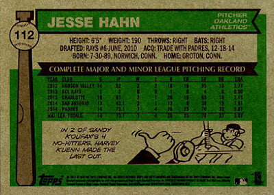
I'm sure someone else has written about this but I'm way behind in my baseball card blog reading.
If you've seen enough older Topps cards (say prior to 1990) you know that there are sometimes small flaws in the cardboard stock, usually noticeable on the back of the card. For reasons only know to them, Topps has put little flaws on the backs of 2015 Topps Archives.
The last time I wrote about something like this was 2009 Topps 206. Remember these?
In order to make the cards look aged, Topps printed them with stains on the back. Identical stains on every card.
In the 1957 series cards there is a small white flaw near the bottom of the stat box. Every 1957 series card I have has this and, as near as I can tell, the faux flaw is in the exact same location on the card.
I kind of looks like it's moving around from card to card but that's only because the stat box is different on each card. While I was putting this together I noticed another one.
The cards which have a cartoon on the back also have a smaller faux flaw within the cartoon. Compare the Arrieta card to the Kershaw card above.
The faux flaw on the 1976 cards is a bit more subtle. Only the cards with a cartoon on the back have it.
Look on the cartoon player's upper bat hand. I have four different cards with this cartoon and all have the faux flaw. Here's another. Look just above the right hand player's belt line.
I first noticed this on the 1983 series cards, where there are actually 3 faux flaws on every card.
The largest is just above the copyright text at the bottom of the card. There is also one in the text bar above the stats. On this card it's in the "T" of Pitching. And there is a very small one in the upper right hand corner, just a little horizontal line. Here are a few more.
The stat box heading on this card is "Major League Pitching Record" instead of "Complete Major League Pitching" so the faux flaw is moved more toward the "N" in pitching.
Unlike the faux stains on 2009 Topps 206, which came near to ruining the whole set for me, this just amuses me. I call these faux flaws because they are not due to irregularities in the card stock, they were designed right into the card. They are pretty subtle and I'm sure the Topps design people had a lot of fun dreaming this up.
I looked at the 2014 Topps Archives cards I have and it doesn't look like Topps pulled this little joke in that set.
Subscribe to:
Post Comments (Atom)


2 comments:
I had not noticed that, but I really like it... and really appreciate it. Sometimes it's the subtle little things that "sell" a throwback design, and Topps seems to be learning these lessons.
I wish they'd put more thought and effort into other, more collectible, things than this.
Post a Comment