Here is the last of the 1990's sets (Bowman, Donruss, Fleer, Score, Topps, Upper Deck) I'm going to profile. Check
Capewood's Theory of Baseball Card Evolution.
Although Score did it first, putting a color photo on the back of the card in 1988, Upper Deck did it better in 1989. 1989 Upper Deck was printed on nicer card stock, had a full card length photo on the back and a holographic logo on the back to prevent counterfeiting. It was also packaged in a foil wrapper to prevent pack searching. And they had the luck to include Ken Griffey, Jr.
1990 Upper Deck #532 Edgar Martinez
1990 Upper Deck was not much different than 1989. Still a very nice set but no real change, and still Stage 3 on the evolutionary scale.
1991 Upper Deck #132 Ryne Sandberg
If you've for a formula that works and nobody else is making cards as nice, why change it?
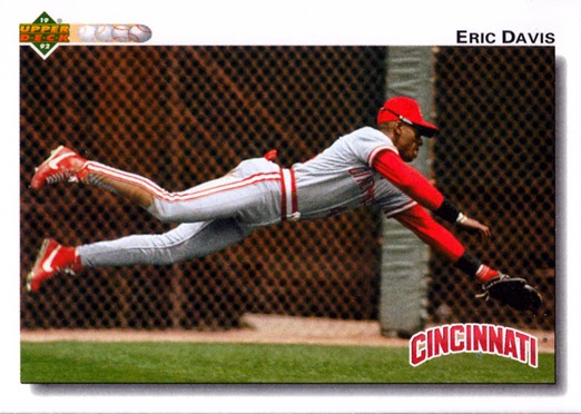
1992 Upper Deck #125 Eric Davis
1992 was still Stage 3 but with some design changes. They made more use of horizontal cards. I always like the drop shadow effect in the front.
1993 Upper Deck #364 Travis Fryman
Upper Deck moves to Stage 4 with the addition of gloss to the front and back of the cards. Upper Deck had always been known for great photography which continued this year. Of the 6 sets I'd been profiling in the series, 1993 Upper Deck may be the best set in the 1990s.
1994 Upper Deck #112 Wade Boggs
In 1994, Upper Deck jumps to their highest evolutionary level, Stage 6, by adding foil and full bleed printing, front and back. Bowman was the only other of the 6 sets to go to Stage 6, but they would abandon full bleed printing in 1995. Upper Deck will stick with it until the end. This is perhaps my second favorite Upper Deck set of the 1990s. The only reason it isn't my favorite is that I never really liked the distorted b/w photo insert on the front.
1995 Upper Deck #142 Fernando Valenzuela
Upper Deck cleaned up the front and produced this classy Stage 6 set in 1995. The only real problem with it is it's similarity to 1995 Topps Stadium Club.
1996 Upper Deck #85 Derek Bell
In the mid-1990s some sets started to get a bit foil-heavy (Pinnacle is the prime example). Of the 6 sets, Donruss and Upper Deck are the only ones at Stage 6. Upper Deck may have a little too much foil but it's a much nicer set than 1996 Donruss.
1997 Upper Deck #48 Lee Smith
In 1997 Upper Deck will experiment with multiple colored foil on the front of the card but will never do it again. The design is otherwise similar to 1996 with a block of foil across the bottom. A nice feature that I don't remember seeing again on any set, is the photograph date in the front. They also started to de-empathize the photo on the back, a trend that will continue until 2000 when the back featured just a small head shot which will remain the norm for Upper Deck until the end in 2010. In my opinion, 1997 was the last best year for Upper Deck.
1998 Upper Deck #224 Dennis Martinez
There is way too much stuff going on on the front of this card for me to ever really like it.
1999 Upper Deck #52 Nomar Garciaparra
This is just horrible, front and back. The color at the bottom of the front is transparent to allow more of the photo to show. It's hard to see on this card, but on some cards the player's feet show down there. The black box underneath the player photo on the back has always bugged me. Maybe they could have put the team, MLB and Players Union logos there and uncluttered the photo.


2 comments:
Upper Deck lost me in 1997. Too much clutter! Cardboard should NOT multi-task! 95 and 96 were the best years for this product.
The 1991 design is still one of my favorite Upper Deck base card designs. Sure miss seeing their baseball products.
Post a Comment