We're at the final matchup of the 2nd Quartile of the Babe Ruth Division.
Today we've got 1994 Donruss vs. 1991 Fleer
1994 Donruss
1994 Donruss is one of my favorite sets of the 1990s. It featured full bleed photography front and back, a nice glossy finish and not too much gold foil. If it has one flaw, it's the box on the front with the set name and team logo. The box on the back is OK, but the solid black background does distract from the photo a bit. The full-sized photo on the back is largely uncluttered but at the expense of a single line of stats.
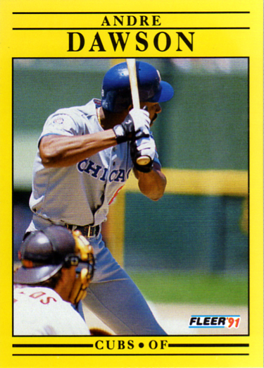
1991 Fleer
The first question might be, how did 1991 Fleer get to the second round of this competition? See the bracket above. It had the luck of meeting the ultimate gimmick set of the 1990s, bubble-gum smelling 1996 Pinnacle Aficionado. 1991 Fleer, while in many better than previous years of Fleer, is still not a great design. And the yellow color, well, that depends on your sense of humor (or outrage), I suppose. And. while not pertinent to the design, these cards are hard to scan. It's hard to get the yellow to come out right on screen.
The Results: One of my favorite cards from the 1990s vs. 1991 Fleer? It's 1994 Donruss in a walk-off.
Going forward:
Some interesting head-to-head competition coming up.


1 comment:
I probably like 1991 Fleer more than most people, but this one was an easy decision. I love the 1994 Donruss design.
Post a Comment