Showing posts with label 1990s Face-Off. Show all posts

Wednesday, February 10, 2016

The 1990s Baseball Card Faceoff

We're at the final matchup of the 2nd Quartile of the Babe Ruth Division.

Today we've got 1994 Donruss vs. 1991 Fleer

1994 Donruss


1994 Donruss is one of my favorite sets of the 1990s. It featured full bleed photography front and back, a nice glossy finish and not too much gold foil. If it has one flaw, it's the box on the front with the set name and team logo. The box on the back is OK, but the solid black background does distract from the photo a bit. The full-sized photo on the back is largely uncluttered but at the expense of a single line of stats.

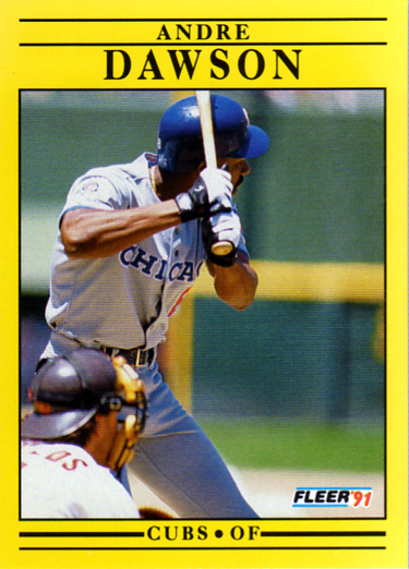
1991 Fleer


The first question might be, how did 1991 Fleer get to the second round of this competition? See the bracket above. It had the luck of meeting the ultimate gimmick set of the 1990s, bubble-gum smelling 1996 Pinnacle Aficionado. 1991 Fleer, while in many better than previous years of Fleer, is still not a great design. And the yellow color, well, that depends on your sense of humor (or outrage), I suppose.  And. while not pertinent to the design, these cards are hard to scan. It's hard to get the yellow to come out right on screen.

The Results:  One of my favorite cards from the 1990s vs. 1991 Fleer? It's 1994 Donruss in a walk-off.

Going forward:


Some interesting head-to-head competition coming up.


Wednesday, January 27, 2016

The 1990s Baseball Card Face-off

Continuing with the Red playoff level of the 2nd quartile of the Babe Ruth Division. Here's the current position.

By the way, if you can't read this, click on the chart to see a larger version. I'm sure you knew that. And while I'm by-the-waying, you can find all the posts in this series by clicking on the tag at the end of the post. You probably knew that as well.

Today we've got 1997 Ultra (a set I didn't buy much of) and 1998 Zenith (a set I don't have any of).

1997 Ultra #406 Kenny Lofton


1997 Ultra #256 Curt Schilling


There is certainly nothing wrong with 1997 Ultra, but as a product, I never much cared for the Ultra line. On reason may be is that year after year, the designs looked pretty much the same to me. You have your full bleed glossy photo on the front with the player name in large print (usually something cursive) at the bottom. You have your multiple photos on the back, and player stats, sometimes full career sometimes not. This year is pretty typical of a lot of years of Ultra. An attractive card but it just doesn't grab me.

1998 Zenith #14 Mike Piazza


1998 Zenith #32  Roger Clemens


These are literally the first cards I've ever seen of this 100-card set. It's one of the last sets produced by the Donruss/Leaf/Score/Pinnacle mash up of the late 1990s. It's not bad looking. I always like the design feature where the parts of the front photo extend into the border of the cards. Having said that, I think the front borders are too wide and the logo is too obtrusive. The cards are kind of dark as well. tradingcarddb.com only has 7 cards from the set scanned, which leads me to believe it wasn't very popular. The color scheme depends on the team colors. There's an Orioles card that's orange where these cards are blue. Still dark. The wheel 'o stats on the back is a bit weird and hard to read.

The Results: In the last post I gave the edge to 1993 Stadium Club over the gimmicky 1998 Topps Stars. I'm going to do the same here and go for 1997 Ultra.

That leaves us near the end of the Red level of this quartile.


Thursday, January 14, 2016

The 1990s Baseball Card Face-off

We're into the Red playoff level of the 2nd quartile of the Babe Ruth Division. Whew, still a long way to go.  Here's the current position.


Today we've got 1993 Stadium Club vs. 1998 Topps Stars

1993 Stadium Club #195 Vince Coleman


1993 Stadium Club #203 Andre Dawson


1993 Stadium Club got here by beating some pretty weak competition, 1991 Bowman. In it's 3rd year, Stadium Club hasn't changed much since 1991. It still combines great action photography and great posed shots with a glossy front and a minimal design and not too much gold foil. I love the Dawson card because it reminds me of the TV commercial where Dawson gets hauled out of the ivy in Wrigley Field. Another great portrait shot is Kirby Puckett's card, #283. The biggest design change for 1993 is to go with a vertical card back. The back also minimizes the player's rookie card (this will be the last year they will use that design feature) and adding another player photo, which will become standard.

1998 Topps Stars #146 Travis Fryman


1998 Topps Stars #109 Manny Ramirez


1998 Topps Stars is what I call a gimmick set and it beat out 1999 Bowman's Best, another gimmick set to get here. Topps Stars is really a set with too many gimmicks. Let's list them: the card is textured on the front with vertical parallel lines; red foil; a background of stars (get it?); a serial numbered base set; and multiple parallels. In 1998 multiple parallels was still a gimmick; it's standard today.  I didn't buy much of this, and in fact, along with the previous post where 1998 Topps Stars appeared, my supply of the base cards is exhausted. 

The Results: In isolation, 1998 Topps Stars may be a nice looking card, even with all the gimmicks, but it just can't stand against 1993 Stadium Club in it's simple, but effective, design.


Monday, January 4, 2016

The 1990s Baseball Card Face-off

Ok, where were we?


Oh, yeah, were were heading into the 2nd round of the Babe Ruth Division Second Quartile. In case you're new here or don't remember what the heck I'm doing, please check this post.

Today it's going to be 1999 Upper Deck MVP vs 1998 Topps Gold Label

1999 Upper Deck MVP

Barry Larkin #57


Chipper Jones #15

There is such a thing as having too much design. That's the basic problem with this set. It's got good photography, the cards have a light gloss, it's got full stats on the back, and even a photo (a small one) on the back. Many collectors don't like foil on cards. I don't mind it so much, except when foil is laid down just for the sake of having foil. What's with all the foil lines and circles on the front? They are repeated on the back, without foil, but still distracting. Also, there are two numbers on the back. One is the card number, very tiny in the upper left, the other is the player's uniform number, much larger on the bottom left. Too confusing.

1998 Topps Gold Label

Randy Johnson #8


Jim Thome #10


When this set came up in it's first match up, I only owned 2 or 3 cards from the set. Now I own 90. After seeing them again I remembered what a great set this was. They were pretty pricy per pack back in 1998 but I got almost the whole set for just $0.15/card. If you'd like to see more of these check them out on tradingcarddb.com. There were only a few cards from the set posted before I uploaded the bunch I bought.

The Results: As you can probably tell from my write up, I'm pretty partial to the 1998 Topps Gold Label.


Wednesday, November 18, 2015

The 1990s Baseball Card Face-off - 1991 Fleer vs 1996 Pinnacle Aficionado

I'm going to determine the best baseball card set from the 1990s. Check this post to see my methodology.

As promised, I'm going to finish off the first level of the Babe Ruth Division 2nd Quadrant. Here are the standings at present.


Today we've got kind of a weird match up, a very old-school card trying to be new vs. a one-shot, modern gimmick card.

1991 Fleer vs. 1996 Pinnacle Aficionado

1991 Fleer #61 Eric Davis


1991 Fleer #276 Matt Williams


1991 Fleer makes a statement, and that statement is YELLOW! Other than the color and the photo on the back, there is not much difference between 1991 Fleer and any other year going back to 1981. A solid Stage 3 card for sure but but starting to fall behind. Based on what I've seen in other blogs, I believe that 1991 Fleer is not much favored by collectors but I always liked it for its boldness.

1996 Pinnacle Aficionado #24 Kirby Puckett


1996 Pinnacle Aficionado #89 Gregg Jefferies


1996 Pinnacle Aficionado was a one-off set that was a bit weird. The all-horizontal card features a sepia-toned photo on the front with a 3/4 head shot of the player in rough textured silver foil. The card backs are black with another head shot in black and white. But the really weird thing about these cards is that they have a smell. The smell is pleasant and is supposed to be of bubble gum although it didn't smell like bubble gum to me. The smell is subtle, not say like a perfume ad in a magazine. Now, nearly 20 years later, the smell is difficult to detect. I always thought the silver foil head shot on the front was kind of creepy. 

The result: You might think, sight unseen, that almost any card from the later 1990s would beat out 1991 Fleer, but I'm giving this to the Fleer product. Despite it's color, it's still a solid, uncomplicated baseball card. Aficionado is just too gimmicky.

Next week we start the upper level competition to crown the champ from the 2nd quadrant of the Babe Ruth Division.