All I knew about Topps Bunt digital cards was that there was such a thing. I have no more interest in collecting digital cards on my phone than I have in collecting Pokemon on my phone. I saw a blaster of Topps Bunt at Target yesterday, and at only $9.99 for the box, I decided to buy one.
Not a bad looking card. I like the giant logo on the front. The backs are nothing special. Like their flagship set, Topps Bunt has built a lot of smoke into the design. What's the deal?
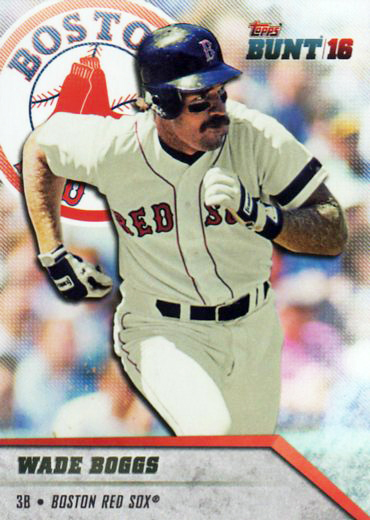
The 200-card set features a lot of former stars which appeals to an older collector like myself.
Every card features an action shot which I also like. Unlike, say 2016 Donruss, where even though every card is an action shot, with Bunt you don't get the feeling that you're looking at the same card over and over. I'm not convinced that the player and the background on Bunt, actually go together. They've put a bit of a black edging to the player which looks like a shadow on a backdrop.
Two things I don't like about the set, one pretty minor the other not so minor.
There are a series of fine parallel lines running through the background, most noticeable near the tops of the cards. The only reason I don't like it is because it looks like the kind of scanning artifact you get on some cards when you scan at low resolution. On Bunt, the lines are clearly visible right on the card, you don't have to scan it to see the lines. Pretty minor point.
The other complaint is an old complaint of mine. Why such tiny letter on the backs? Especially the card numbers. It's not like there isn't plenty of space on the back.
And here's something peculiar.
When I looked at this card, I couldn't miss the giant registered trademark mark just under the Mets logo. The first cards I looked at didn't have that. Looking through all the cards I have, I see that only the Mets and Giants cards have trademarks. And the marking isn't consistent. Here's another Met.
You have to look pretty close to see the TM on the right edge of the card. Why just Mets and Giants? In the Topps flagship set, for example, every team name has either a TM or a circled R.


1 comment:
Only because it's the last thing in your post I'm annoyed in general at the whole trademark thing. Otherwise they're nice looking cards and because I'm also in the older category I agree about the retired players. Nice KB!
Post a Comment