Here's were we were last week:
1993 Flair vs. 1996 Studio
1993 Flair Willie Blair #36
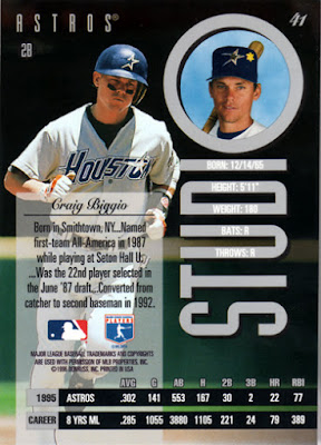
1996 Studio Craig Biggio #41
In my opinion, there is little wrong with 1996 Studio. Crisp colors, full bleed printing, head in a porthole. But, also in my opinion, there is everything right with 1993 Flair. I have loved this set since the fist day I saw them in the last local card shop in the southern Houston suburbs. I only have about 20 of them. They were darn expensive for 1993, a 5-card pack went for $5.
The Result: 1993 Flair
1991 Upper Deck vs. 1994 Topps
1991 Upper Deck Roger Clemens #655
1994 Topps Darren Daulton #380
Man, I like both of these cards as well. Superficially, there's not much difference between them. Both feature good photography, white borders and a color photo on the back. 1994 Topps is higher on the evolutionary scale than 1991 Upper Deck, as it is glossy, but in this case, that doesn't matter much. Nobody was producing glossy cards in 1991 whereas everybody was by 1994. Two things I've always liked about 1991 Upper Deck: the baseball colored photo borders (green for grass, light brown for dirt) and the placement of the photo on the back.
Result: 1991 Upper Deck
Final Round
1993 Flair vs 1991 Upper Deck
1993 Flair Hal Morris #29
1991 Upper Deck Tony Gwynn #255
When I started this I didn't realize how difficult it was going to be to make some choices. I obviously like like 1991 Upper Deck, but I love the overall look and feel of 1993 Flair.
The Result: 1993 Flair
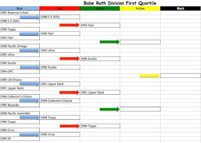
So let's fill out the rest of the bracket.
So where does 1993 Flair fit into the overall scheme of the competition? 1993 Flair has reached the "Sweet Sixteen" level of the Face-off. You're probably going to have to click on this image to understand it.
Next week we'll start the 2nd Quartile of the Babe Ruth Division.


3 comments:
That final four had tough choices! I probably would have gone with 96 Studio, but I am OK with any of the four for various reasons.
I would have called it the exact same way. Looking forward to the next bracket.
Just now reading these. Very cool idea.
I'd have gone with 1993 Flair as well. An underrated set. The photos look like they are in HD. And the thick card stock was amazing at the time the set was released.
I'd probably put 1991 Upper Deck 3rd on the sets you've got listed. I'm really partial to 1994 CC. I get your point that it was similar to 1993 Upper Deck, but I think it had enough differences (including a different set name) to no be a re-hash, and '93 UD is probably my choice as the best set of the 90's!
Post a Comment