I picked up a blaster, a rack pack and a rack box at Walmart last week. So far, the Targets around here don't seem to have the product yet.
The 2013 Topps design is perhaps the best of the century. The design is simple yet elegant. It works well with both vertically and horizontally oriented cards. The photo selection is strong. The backs are also nice. The implementation of the the front design onto the back of the card is works well. I like the integration of the card number into the baseball diamond motif from the front. The backs are also easy to read. In past years some of the color combinations have made the backs inscrutable. In particular, in 2012, the team name color and the background color it was on made it real hard to read. This year only the yellow teams (like the Pirates) are a bit difficult, since it's yellow on white. And for the first time in years, the front does not have silver foil text on a black background. Here's a sample of what I pulled.
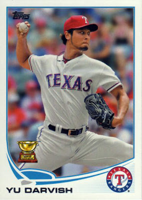
#11 Yu Darvish
I also like the placement of the team logo on a fine grid in the card highlight color.
#12 A. J. Pierzynski
There is maybe a bit too much white space on the horizontal cards but much better than the 2012's stretching of the 'surf board' all the way across the card.
#33 Cliff Lee
I pulled 4 Phillies cards. Here's hoping Cliff Lee has some better luck this year.
#83 Darin Ruf
Ruf only played in 12 games in the majors last year but he tore up the minor leagues breaking Ryan Howard's single season home run record. He put on quite a show last September for the Phillie Phans.
#179 Detroit Tigers
There are not a lot of subset cards. There are cards from various playoff games...
#194 Cabrera, Hamilton, Encarnacion
...and League Leader cards. That's it.
#266 Albert Pujols Checklist
The checklist cards feature a player on the front.
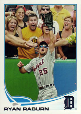
#330 Ryan Raburn
My favorite card in Series 1. This card features more wide open mouths and cleavage on any single card I can think of. And would not surprise me at all to learn that the card is Photoshopped.
Topps Emerald Foil #181 Jeff Keppinger
This is the third year in a row Topps has used this technology in their flagship product. This year, they made them green. I pulled two of these.
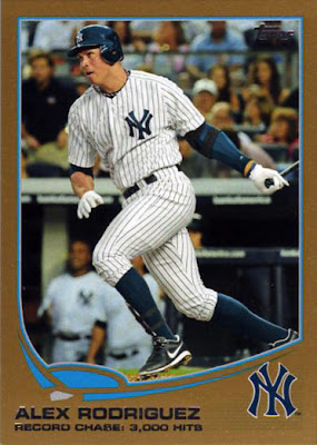
Gold #303 Alex Rodriguez Checklist
Serial numbered gold cards are back. This is the only one I pulled.
Topps Blue Walmart #5 Carlos Gonzalez
I always like Walmart's blue bordered parallels. Every blue parallel I pulled from the blaster box (20 in all) were horizontally oriented cards. That seems pretty improbable so I suspect that Walmart packed some boxes that way deliberately. But why?
Wednesday, February 6, 2013
2013 Topps Base and Parallel - First Look
Labels:
baseball cards,
cliff lee,
phillies,
Players I Collect,
pujols,
topps
Subscribe to:
Post Comments (Atom)


1 comment:
This is cool!
Post a Comment