2016 Stadium Club has finally arrived in my corner of SE Texas. I got 2 blasters and 2 rack packs at Walmart the other day.
I've liked the past 2 years of this product and I think I like this year the best. Here's what I pulled from the first rack pack I opened.
Pretty simple design. I have a slight quibble that the silver foil on the front can be a little hard to read depending on the photo. It scans really well however. The cards have a nice silky gloss that I really like on a card. The backs are pretty simple. Topps is the set you got for if you like a lot of stats on the back. Stadium Club you buy for the design and the photography. I'm really happy to see that they did not include any photographic tricks on the front like the smoke or haze or whatever on Topps.
There seems to be a nice selection of retired players. In my, probably, never ending complaint over Topps reusing photographs, I think the back photo here is the same they used 2014 Gypsy Queen.
Good action shot.
Have you ever heard a baseball player talk about the 'job' of baseball. You know, stuff like "I've got a job to do and I work at it as hard as I can". Here's the difference between playing baseball and a job. Before i retired, i had a job I liked and I worked at it as hard as I could. But when we had a great success at work, what is depicted on this card never happened. Not once.
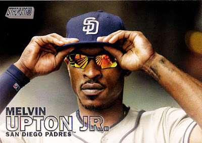
Melvin with the cool shades. A question, should I go back to all the B. J. Upton cards in my catalog and change is name to Melvin?
I like cards that feature baseballs in flight. Leaving the pitchers hand, leaving the batter's bat, landing in a glove, whatever.
Another flying baseball.
Another retired player in the pack. If there had been a rookie card in the pack I'd have had an example of all the subsets for my reference set.
Half of the cards in this 12-card pack featured horizontal cards. I wonder what the proportion is for the set as a whole?
Another indication that baseball is not a 'job'. I mean we had some fun around the office, but not like this.
It wouldn't be a modern baseball set if it didn't have parallels. Here's the Gold parallel. Actually, Stadium Club doesn't have all that many parallels.
As they did last year, some way longer ago players are featured on black and white cards. I was originally hoping that this was one of the Black and White parallels but of course, it's not.
All in all, a pretty satisfying.
Monday, July 11, 2016
Subscribe to:
Post Comments (Atom)


1 comment:
If a player's name changes, I just put the "old/"lesser used" name in parenthesis next to his "new/current" name.
Post a Comment