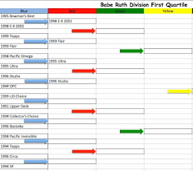
Yesterday we finished here.
Today we've got an Upper Deck product from early in the decade against an Upper Deck product late in the decade. In 1991, there was only one Upper Deck product. By 1999, there were many Upper Deck products. I'm not sure anyone in 1991 predicted the proliferation of baseball card produced in the 1990s.
1991 Upper Deck
1991 Upper Deck featured good photography on the front and back, the back action photo taking up a good 2/3rds of the card. It had a nice white, although thin, card stock (which has tended to yellow over time) and no gloss. Plus that hologram logo in the back.
1999 UD Choice
Upper Deck replaced the Collector's Choice brand with UD Choice in 1999. Why? Who knows? Fewer letters in the set name? UD Choice was printed on thin white card stock with gloss on front and back. In an era when pretty much all cards had some sort of foil on them, UD Choice had none. The backs featured a color head shot and full stats. The stats block pretty much determined the size of the other elements on the back. Note that Galarraga has a much smaller photo than the Guerrero card. And no hologram.
Results: By 1991 some though that the Upper Deck design was getting a bit stale. It was almost revolutionary when introduced in 1989 and even though most other manufacturer's designs were lagging behind Upper Deck by 1991, the design was getting a bit too familiar. Even so, I'm giving this one to 1991 Upper Deck. The UD Choice card is just too busy, especially the back. You've got the stats, a photo, player's name in two size fonts, team logo, three trivia questions, and the players uniform number (which is printed to look just like the card number leading to confusion). And with all that, they found room to leave a plain white rectangle.
Next up 1994 Collector's Choice vs. 1996 Bazooka.


Love this bracket idea! I've agreed with every pick so far!
ReplyDeleteThe 98UD Choice isn't too shabby of a design... but it's face off between these two designs isn't even close in my book. I really, really like the 91UD design. It's just a shame it was so overproduced.
ReplyDelete